
Introduction to scatter plots
A scatter plot displays two values (x,y) from continuous scales for each point, and can be used any time you want to show the relationship between two continuous variables. Many popular bioinformatic visualizations are simply highly customized forms of scatter plot. The skills and tools covered in this chapter are generalizable to all scatter plots.
 Legends and axis labels have been suppressed in the figures above in
order to save space.
Legends and axis labels have been suppressed in the figures above in
order to save space.
QA/QC figures
The simplest type of scatter plots, QA/QC plots are produced for diagnostic purposes. While they are often less polished than other figures (as they are unlikely to be included in publication), QA/QC plots are valuable tools for informing decisions during the course of analysis.
Dimensionality reduction biplots
PCA, MDS, tSNE, and UMAP are all popular methods of projecting variation in a highly-dimensional data set onto a lower-dimensional space. Samples are assigned coordinates on two or more axes that summarize across hundreds or thousands of variables (e.g. gene expression values in an RNA-seq experiment) to capture key features within the data While the math behind these methods differs, the visualization is analogous; two of the dimensions are assigned to the axes of the plot, and metadata can be used to label the points.
Volcano plots
Plotting -log10(P) against log2-fold change produces the characteristic “volcano” shape that gives this plot its name. Volcano plots provide an overview of the magnitude and significance of gene expression changes in an experiment. Adding call-out annotations gives a sense of where genes of interest lie with regard to these features.
Manhattan plots
A staple of GWAS studies, a Manhattan plot displays the relationship of SNPs to the trait under investigation. Like a volcano plot, point placement along the y axis is determined by -log10(P), but the x value of each point represents genomic coordinate of the SNP, rather than RNA expression data. Plots may be gray-scale or colored to aid in distinguishing chromosomes.
Set-up
In this chapter, we will begin with the fundamentals of assembling a scatter plot, layer on additional information using graphical attributes like color and point shape, and modify plot elements to customize figure appearance and improve readability. The first example we will work with is a volcano plot.
Packages
We will be working extensively with ggplot2 over the course of this workshop. Part of the tidyverse ecosystem, ggplot2 is a comprehensive, flexible framework for producing highly customizable graphics of many types. We will also make use of dplyr, another tidyverse package, to clean and reshape data before plotting.
library(dplyr)
library(magrittr)
library(kableExtra)
library(ggplot2)
library(ggrepel)
Data
The data for our volcano plot comes from our RNA-Seq workshop, at a point in the analysis after the first contrast of the differential expression analysis has been computed. The code assumes that a table of differential expression results and an Ensembl Biomart annotation export are available.
de <- read.delim("mouse_DE_result.txt", sep = " ")
de$Gene.stable.ID.version <- rownames(de)
anno <- read.delim("mouse_annotations.txt", sep = " ")
anno <- anno[!duplicated(anno$Gene.stable.ID.version),]
Explore the data. What values are available in each table? Which columns are relevant to creating the volcano plot? Is the data ready to plot as-is? If not, what transformations do you need to do in order prepare for the plot?
Plot points
In its most basic form, a volcano plot is simply a collection of scatter plot showing the relationship between P-value and log fold change.
A ggplot2 object is built in layers, with each layer inheriting
parameters from the previous elements. The parent plot is created by the
ggplot() call, and subsequent layers are added with “geoms.” Here, we
have applied geom_point(), which creates scatter plots.
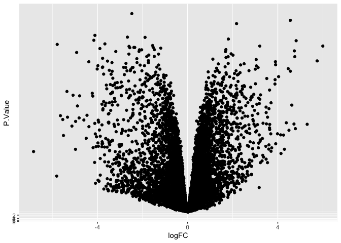
ggplot(data = de, mapping = aes(x = logFC, y = P.Value)) +
  geom_point()
Transformations
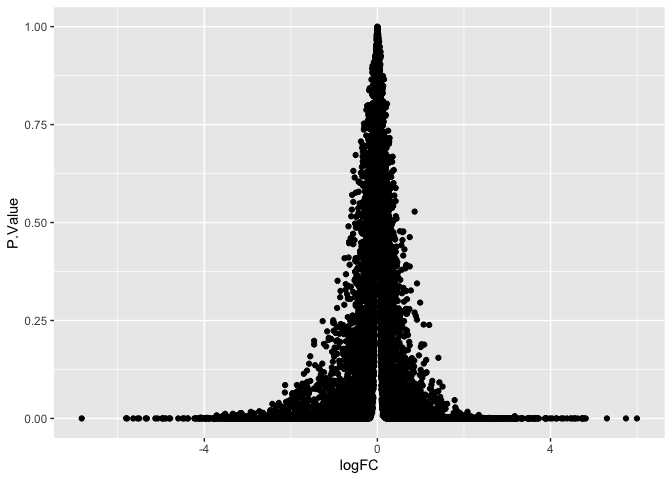
The plot above needs some adjustments to be useful; the points of greatest interest (with near-zero p-values) are all squished into the very bottom of the plot.
Transformations can be applied to either (or both) axes in two ways: through scale axis functions, or by operating directly on the data itself.
Transform data using scale functions
There are a number of built-in scale functions, including
log10 and reverse, which multiplies by -1. Neither of these
is sufficient on its own, and the scales package does not provide a
predefined -log10n transformation. We can construct a custom
transformation using the new_transform() function from the scales
library, one of ggplot2’s dependencies.
ggplot(data = de, mapping = aes(x = logFC, y = P.Value)) +
geom_point() +
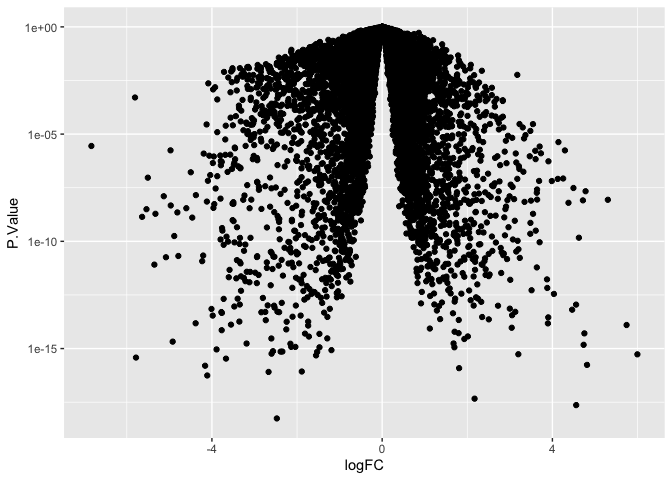
scale_y_log10()
ggplot(data = de, mapping = aes(x = logFC, y = P.Value)) +
geom_point() +
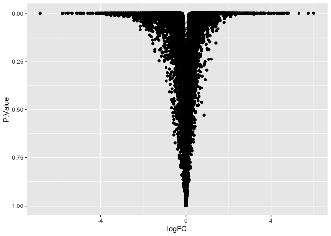
scale_y_reverse()
ggplot(data = de, mapping = aes(x = logFC, y = P.Value)) +
  geom_point() +
  scale_y_continuous(transform = scales::new_transform(name = "neg.log.10", transform = function(x){-log10(x)},
                                                       inverse = function(x){1 / 10**x}))
Transform data directly
Alternatively, in the case of the relatively simple -log10
transformation, we can apply it quickly and easily from within the
ggplot() call.
ggplot(data = de, mapping = aes(x = logFC, y = -log10(P.Value))) +
  geom_point()
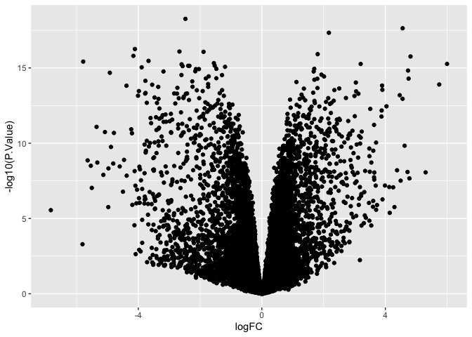
Note that the minor ticks on the y-axis behave differently!
Axis ticks are determined by “breaks” in the plotted data. When using the scale axis commands, the breaks are applied ot the untransformed data, and y-axis values reflect that. By contrast, when we compute the transformation inside the plotting function, breaks are computed on the transformed values.
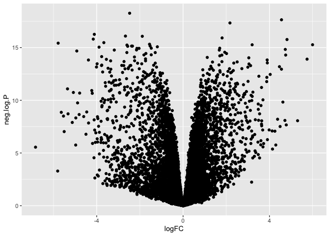
Finally, if we need to perform a complex, multi-step transformation, and do not wish to create a custom transformation for scale_y_continuous, we can create a new column in our data frame that contains the transformed values and plot that column instead.
neg.log.10 <- function(x){-log10(x)}
mutate(de, "neg.log.P" = neg.log.10(P.Value)) %>%
  ggplot(mapping = aes(x = logFC, y = neg.log.P)) +
  geom_point()
Communicate additional information using point properties
While the coordinate space of a scatter plot communicates the values of two continuous variables, other visual qualities (aesthetics in ggplot) can be used to encode additional information, both categorical and continuous.
Scatter plots have the following mappable aesthetics:
- shape
- size
- fill
- stroke
- alpha
- color
You can assign variables to any number of these aesthetics. Some caveats apply.
Shape is only suitable for categorical values, and cannot be used on very densely plotted points, where distinguishing shape becomes difficult.
Size should be used with caution, as it implicitly communicates a sense of quantitative difference that is not appropriate for some qualitative measures (e.g. case vs control).
Alpha, which controls point opacity, can be a difficult scale in which to visualize fine gradations of a continuous variable.
Fill and stroke are only useful with a subset of available point shapes; explore this documentation to understand why.
For these reasons, color and shape are typically the most-used
aesthetics for geom_point(), with additional information mapped onto
subsequent layers as needed. We will address color with the volcano plot
example, and return to shape and size for other styles of scatter plot.
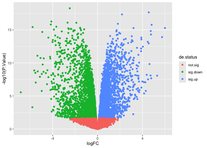
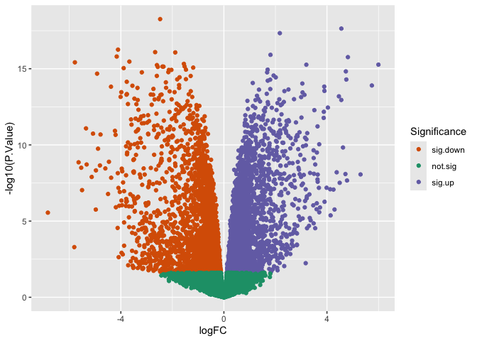
Often, volcano plots are colored by significance. Let’s add a column to our data table that encodes the DE status of each gene (up, down, or not significant).
de$de.status <- ifelse(de$adj.P.Val >= 0.05, "not.sig", ifelse(de$logFC > 0, "sig.up", "sig.down"))
At this point, our plot is starting to look a little like the example.
We can save the plot object and add layers using the + operator as we
go to save repeating the code.
p <- ggplot(data = de, mapping = aes(x = logFC, y = -log10(P.Value))) +
  geom_point(mapping = aes(color = de.status))
p
To adjust the color, we can use one of two methods: built-in palettes, or manual palette creation.
Built-in palettes: Rcolorbrewer
The scale_color_brewer() function maps selections from the
ColorBrewer
resource onto the color aesthetic. These were designed for maps, but
work in a wide variety of visualization types. The darker palettes tend
to be more readable in scatter plots, unless a dark background is
selected to make the most of a pastel color scheme.
p + scale_color_brewer(name = "Significance",
                       palette = "Dark2",
                       breaks = c("sig.down", "not.sig", "sig.up"))
Built-in palettes: viridis
Viridis
is another color palette resource. To access the viridis palettes
seamlessly within ggplot2, we can call the scale_color_viridis_ family
of functions: d for discrete data, b for binned data, and c for
continuous data.
p + scale_color_viridis_d(name = "Significance",
                          option = "plasma",
                          breaks = c("sig.down", "not.sig", "sig.up"))
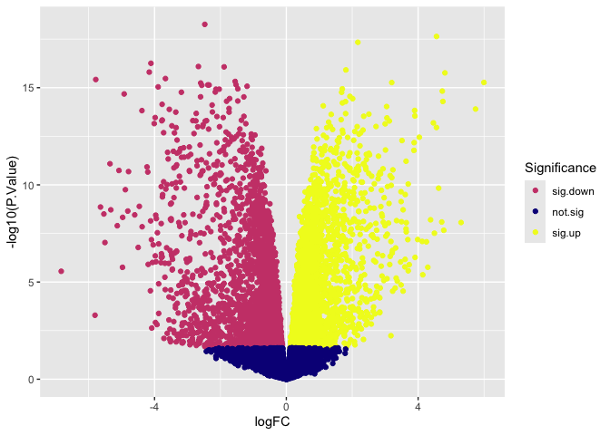
Both viridis and ColorBrewer offer a selection of palettes designed to be readable to users with color vision deficiencies and in print. Feel free to explore, modifying the code to produce different appearances.
Custom color palettes
There are two typical color schemes for volcano plots.
- A two-color scheme in which non-significant points are black or gray while significant points are colored (usually red or blue).
- A three-color scheme in which non-significant points are gray, down-regulated points are blue, and up-regulated points are red.
The simplest way to set custom colors for a ggplot object is with
scale_color_manual().
p <- p + scale_color_manual(name = "Significance",
                            values = c("gray", "dodgerblue4", "firebrick2"),
                            labels = c("Not significant", "Down-regulated", "Up-regulated"))
p
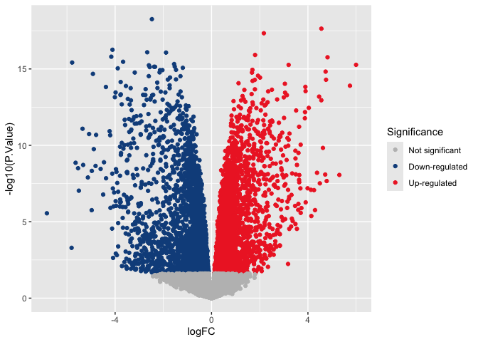
Notice that the “name” and “labels” arguments have changed the appearance of the legend.
Adding information with a second geom
Our data frame contains more information we have not been able to display using the point geom. If we want to include some of that information in our plot, we can add more layers.
Adding lines
Sometimes guidelines can be useful on busy plots. The code below adds a vertical line to aid in understanding expression change magnitude. These are often particularly helpful in QA/QC plots, when discussing filtering thresholds.
p + geom_vline(xintercept = c(-log2(20), log2(20)))

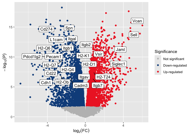
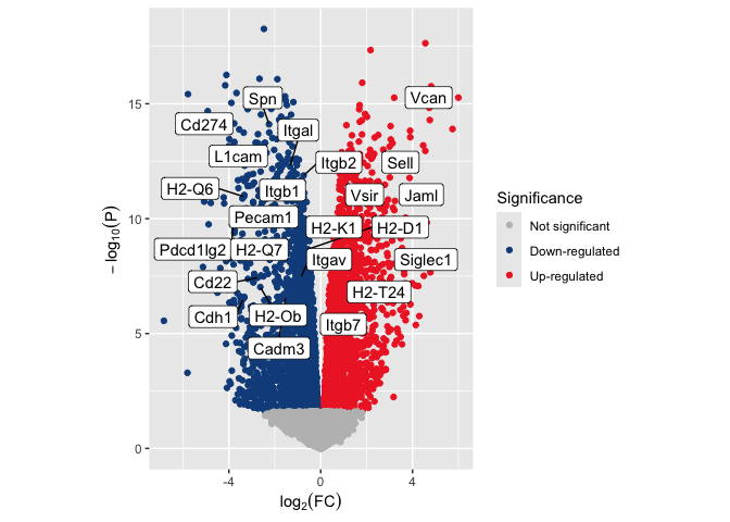
Adding selected gene symbols
The example volcano plot has an additional layer calling out the locations of genes of interest. In order to display gene symbols on the plot, we must add them to our data frame.
volcano.data <- left_join(de, anno, by = "Gene.stable.ID.version") %>%
  select(Gene.name, logFC, P.Value, adj.P.Val, de.status)

slice(volcano.data, 1:50) %>%
  kable() %>%
  kable_styling("striped", fixed_thead = TRUE) %>%
  scroll_box(height = "200px")
| Gene.name | logFC | P.Value | adj.P.Val | de.status |
|---|---|---|---|---|
| Smc6 | -2.474865 | 0 | 0 | sig.down |
| Cd177 | 4.558642 | 0 | 0 | sig.up |
| Ccr2 | 2.171072 | 0 | 0 | sig.up |
| Dusp16 | -4.109923 | 0 | 0 | sig.down |
| Spata13 | -2.668725 | 0 | 0 | sig.down |
| Pag1 | -1.888581 | 0 | 0 | sig.down |
| C3 | 1.807622 | 0 | 0 | sig.up |
| Tgm2 | -4.160120 | 0 | 0 | sig.down |
| Fn1 | 4.813375 | 0 | 0 | sig.up |
| Cd9 | -3.669411 | 0 | 0 | sig.down |
| Cd300e | -5.784074 | 0 | 0 | sig.down |
| Rap1gap2 | -1.553448 | 0 | 0 | sig.down |
| Vcan | 5.996912 | 0 | 0 | sig.up |
| Plcb1 | 3.199356 | 0 | 0 | sig.up |
| Pglyrp1 | -2.598834 | 0 | 0 | sig.down |
| Krt80 | -1.527107 | 0 | 0 | sig.down |
| Stap1 | -2.385559 | 0 | 0 | sig.down |
| Smpdl3b | -2.344597 | 0 | 0 | sig.down |
| Cd82 | -2.565359 | 0 | 0 | sig.down |
| Myo1g | -1.191531 | 0 | 0 | sig.down |
| Ikzf3 | -3.891090 | 0 | 0 | sig.down |
| Hip1 | -1.472679 | 0 | 0 | sig.down |
| Cd84 | 1.697589 | 0 | 0 | sig.up |
| Ddit4 | -2.038446 | 0 | 0 | sig.down |
| Agpat4 | -2.136703 | 0 | 0 | sig.down |
| Ly6c2 | 4.733558 | 0 | 0 | sig.up |
| Mdm1 | -2.155969 | 0 | 0 | sig.down |
| Rps6ka2 | -3.185953 | 0 | 0 | sig.down |
| Emb | 1.677607 | 0 | 0 | sig.up |
| Jade2 | -4.922221 | 0 | 0 | sig.down |
| Tgfbi | 1.929852 | 0 | 0 | sig.up |
| Cyth3 | -2.603455 | 0 | 0 | sig.down |
| Stk10 | -1.289552 | 0 | 0 | sig.down |
| Hjurp | -1.721442 | 0 | 0 | sig.down |
| Notch1 | 2.013507 | 0 | 0 | sig.up |
| Pou2f2 | -1.474004 | 0 | 0 | sig.down |
| Sipa1l1 | -1.812531 | 0 | 0 | sig.down |
| F13a1 | 4.751471 | 0 | 0 | sig.up |
| Ifi209 | 1.796085 | 0 | 0 | sig.up |
| Stard9 | 1.701745 | 0 | 0 | sig.up |
| Tgfbr3 | -3.770226 | 0 | 0 | sig.down |
| Spn | -2.252719 | 0 | 0 | sig.down |
| Lgals3 | 1.119943 | 0 | 0 | sig.up |
| Cd93 | 3.043910 | 0 | 0 | sig.up |
| Cyp2ab1 | -1.738950 | 0 | 0 | sig.down |
| Mmp8 | 5.743029 | 0 | 0 | sig.up |
| Cd274 | -3.551720 | 0 | 0 | sig.down |
| Chil3 | 3.894182 | 0 | 0 | sig.up |
| Ets1 | -4.382721 | 0 | 0 | sig.down |
| Cyfip2 | -2.243993 | 0 | 0 | sig.down |
Now we can use a vector of gene names to select rows of the volcano data frame to add to an annotation layer which will be placed on top of the plot. In this case, the selected genes are members of the KEGG pathway mmu04514 (cell adhesion molecules).
highlight.genes <- c("Vcan", "Spn", "Cd274", "Sell", "Itgal", "L1cam", "Itgb1", "Itgb2", "Vsir", "H2-Q6", "Pecam1", "Jaml", "Pdcd1lg2", "H2-K1", "H2-Q7", "H2-Q4", "H2-D1", "Siglec1", "Itgav", "H2-T24", "Cd22", "H2-Ob", "Cadm3", "Cdh1", "Itgb7")

volcano.annotations <- volcano.data[volcano.data$Gene.name %in% highlight.genes,]

kable(volcano.annotations) %>%
  kable_styling("striped", fixed_thead = TRUE) %>%
  scroll_box(height = "200px")
| Gene.name | logFC | P.Value | adj.P.Val | de.status | |
|---|---|---|---|---|---|
| 13 | Vcan | 5.9969115 | 0e+00 | 0.0e+00 | sig.up |
| 42 | Spn | -2.2527187 | 0e+00 | 0.0e+00 | sig.down |
| 47 | Cd274 | -3.5517202 | 0e+00 | 0.0e+00 | sig.down |
| 86 | Sell | 4.5565518 | 0e+00 | 0.0e+00 | sig.up |
| 124 | Itgal | -1.3401718 | 0e+00 | 0.0e+00 | sig.down |
| 136 | L1cam | -2.9445201 | 0e+00 | 0.0e+00 | sig.down |
| 140 | Itgb1 | -1.0385589 | 0e+00 | 0.0e+00 | sig.down |
| 142 | Itgb2 | -0.7464864 | 0e+00 | 0.0e+00 | sig.down |
| 203 | Vsir | 0.8070507 | 0e+00 | 0.0e+00 | sig.up |
| 238 | H2-Q6 | -3.3463234 | 0e+00 | 0.0e+00 | sig.down |
| 272 | Pecam1 | -2.9416637 | 0e+00 | 0.0e+00 | sig.down |
| 304 | Jaml | 3.1502195 | 0e+00 | 0.0e+00 | sig.up |
| 376 | Pdcd1lg2 | -3.7972785 | 0e+00 | 0.0e+00 | sig.down |
| 465 | H2-K1 | -0.9120402 | 0e+00 | 0.0e+00 | sig.down |
| 470 | H2-Q7 | -2.4257076 | 0e+00 | 0.0e+00 | sig.down |
| 603 | H2-Q4 | -1.1425317 | 0e+00 | 0.0e+00 | sig.down |
| 606 | H2-D1 | -0.5604793 | 0e+00 | 0.0e+00 | sig.down |
| 746 | Siglec1 | 2.9425501 | 0e+00 | 1.0e-07 | sig.up |
| 920 | Itgav | -0.8565869 | 0e+00 | 4.0e-07 | sig.down |
| 923 | H2-T24 | 0.8824936 | 0e+00 | 5.0e-07 | sig.up |
| 930 | Cd22 | -2.7476424 | 0e+00 | 5.0e-07 | sig.down |
| 1067 | H2-Ob | -2.6340521 | 1e-07 | 1.0e-06 | sig.down |
| 1211 | Cadm3 | -1.5238668 | 3e-07 | 2.6e-06 | sig.down |
| 1248 | Cdh1 | -3.3816129 | 3e-07 | 3.0e-06 | sig.down |
| 1286 | Itgb7 | 0.7741286 | 4e-07 | 3.7e-06 | sig.up |
p <- p + geom_label_repel(data = volcano.annotations, mapping = aes(label = Gene.name))
p

Customize plot elements
Taking your figure from “complete” to “publication-ready” can be laborious. Relatively minor details that you may not worry about when preparing a plot for a meeting with collaborators become more noticeable when printed on a poster, composed with other plots for a multi-panel figure in a manuscript, or projected onto a large screen at a conference. While it is not always necessary (or wise!) to spend the time perfecting each element of your plot, having the tools to do so can increase the impact of your visualizations.
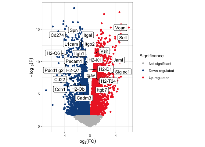
Format axis labels
The labs() function allows editing plot labels, including axes, title,
caption, and legend titles. The code below uses bquote() to include a
subscript within each axis label.
p <- p + labs(y = bquote(-log[10](P)),
              x = bquote(log[2](FC)))
p
Control aspect ratio
By default, plot area is controlled by the size of the graphics device
(e.g. html document or PDF) to which the plot is printed. The aspect
ratio will change to fit the available space, and can be altered by
things like the size of the legend. This behavior means that the same
plot saved to a US Letter sized PDF with and without the legend (or with
different length text in the legend) may have a very different
appearance, skewing perception of the data. To avoid this pitfall, we
can set an aspect ratio with coord_fixed() ensuring that the
relationship of points to one another will remain unchanged no matter
the dimension of the graphics device.
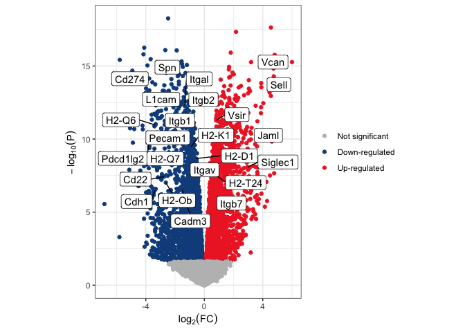
p <- p + coord_fixed(ratio = 1)
p
Change plot background
Because we’ve chosen a medium gray as our “not significant” color, it
may be a good idea to change the color of the plot panel background.
There are a number of pre-set plot designs within ggplot2 called
themes. The default is
theme_gray(). The example below shows theme_bw().
p <- p + theme_bw()
p
Explore the themes. Which ones do you prefer? What uses do you see for the differing themes?
Remove redundant plot elements
In addition to the pre-built themes, ggplot2 provides the theme()
function, which gives access to the underlying plot elements. Using this
on top of the built-in themes gives you a greater degree of control over
the appearance of your plot.
p <- p + theme(legend.title = element_blank())
p
There are an enormous number of arguments accepted by theme(). Take a
look at the help statement, and try making a few alterations to your
plot.
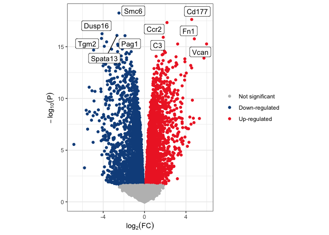
Complete volcano plot code
Once you are more familiar with the grammar of a ggplot object, you may not need to view your plot after each layer. The code below produces a volcano plot with five up- and five down-regulated genes highlighted without saving any intermediate plot objects.
# select genes to highlight
v.anno <- volcano.data %>%
  arrange(adj.P.Val) %>%
  group_by(de.status) %>%
  slice(1:5) %>%
  ungroup() %>%
  filter(de.status %in% c("sig.up", "sig.down"))
# plot
ggplot(data = volcano.data, mapping = aes(x = logFC, y = -log10(P.Value))) +
  geom_point(mapping = aes(color = de.status)) +
  scale_color_manual(values = c("gray", "dodgerblue4", "firebrick2"),
                     breaks = c("not.sig", "sig.down", "sig.up"),
                     name = "Significance",
                     labels = c("Not significant", "Down-regulated", "Up-regulated")) +
  geom_label_repel(data = v.anno, mapping = aes(label = Gene.name)) +
  labs(y = bquote(-log[10](P)), x = bquote(log[2](FC))) +
  coord_fixed() +
  theme_bw() +
  theme(legend.title = element_blank())
Everything we covered above applies to all scatter plots. For the next few examples, there will be minimal documentation of functions we have already used, but a more detailed breakdown of plot elements we have not yet addressed.
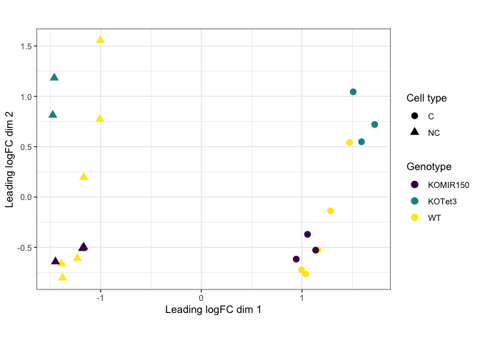
Adding shape
As mentioned above, shape can be very useful when mapping a categorical value to a small number of points. For this example, we will use an MDS plot.
mds <- read.csv("mouse_mds.csv")
q <- ggplot(data = mds, mapping = aes(x = x, y = y, color = genotype, shape = cell_type)) +
  geom_point(size = 3) +
  labs(x = "Leading logFC dim 1", y = "Leading logFC dim 2", color = "Genotype", shape = "Cell type") +
  scale_color_viridis_d() +
  coord_fixed() +
  theme_bw()
q
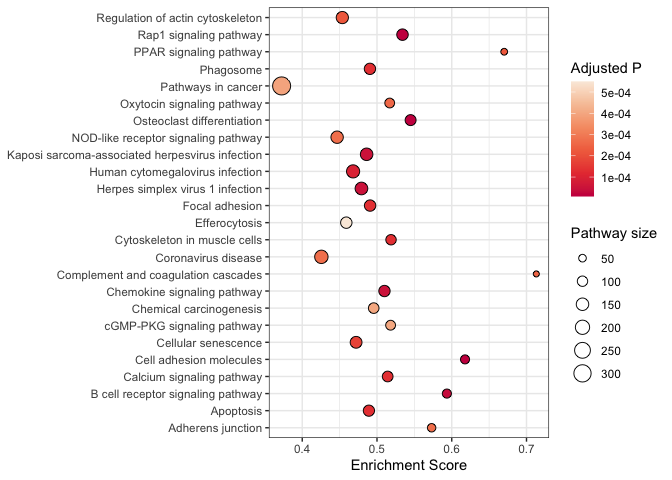
Using point size
While not suitable for the volcano or dimensionality reduction plots shown above, size can be a useful attribute in communicating quantitative values in a scatter plot.
One of the challenges with using size in a scatter plot is that, in
densely plotted data, larger point sizes may collide, obscuring some of
the data. Dot plots, a use of geom_point() that violates the typical
guidelines about scatter plots, are an ideal time to use the point size.
Instead of continuous x and y values (standard for scatter plots), dot plots require categorical values on both axes. Each x,y pair is represented by a single point, so there’s no need to worry about larger point sizes causing difficulty.
kegg <- read.csv("mouse_KEGG.csv")
kegg$displayName <- sapply(strsplit(kegg$Description, split = " -"), "[[", 1L)
r <- kegg %>%
  arrange(p.adjust) %>%
  slice(1:25) %>%
  ggplot(mapping = aes(x = displayName, y = enrichmentScore)) +
  geom_point(mapping = aes(size = setSize, fill = p.adjust), shape = 21) +
  scale_size_area(breaks = seq(from = 0, to = 300, by = 50)) +
  scale_fill_viridis_c(option = "rocket", begin = 0.5) +
  labs(size = "Pathway size", fill = "Adjusted P", y = "Enrichment Score") +
  coord_flip() +
  theme_bw() +
  theme(axis.title.y = element_blank())
r
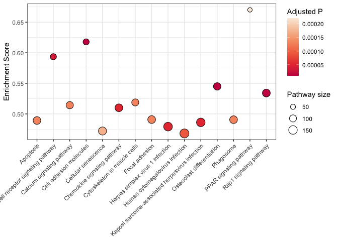
Axis text appearance
When dealing with long variable names, like the KEGG pathways listed above, it is important to adjust the axis text appearance to maximize readability. Consider the example below with pathway descriptions on the x axis.
kegg %>%
  arrange(p.adjust) %>%
  slice(1:15) %>%
  ggplot(mapping = aes(x = displayName, y = enrichmentScore)) +
  geom_point(mapping = aes(size = setSize, fill = p.adjust), shape = 21) +
  scale_size_area(breaks = seq(from = 0, to = 300, by = 50)) +
  scale_fill_viridis_c(option = "rocket", begin = 0.5) +
  labs(size = "Pathway size", fill = "Adjusted P", y = "Enrichment Score") +
  theme_bw() +
  theme(axis.text.x = element_text(angle = 45, hjust = 1, vjust = 1),
        axis.title.x = element_blank())
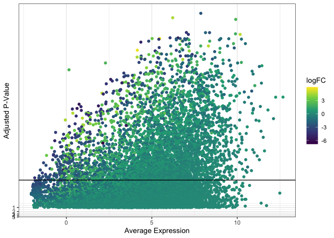
Addressing over-plotting
While the MDS and dot plot data are sparse, some scatter plots may visualize tens of thousands of points (or more). This can result in over-plotting, where some of the data is obscured. Over-plotting is problematic when it gives a false impression of the distribution of variation within the data.
For the next few examples, we will use the data from our volcano plot. Instead of plotting log[2] fold change on the x-axis, however, we will use mean expression as our independent variable. This produces an over-plotted cloud of points that works well for exploring methods of handling densely plotted data.
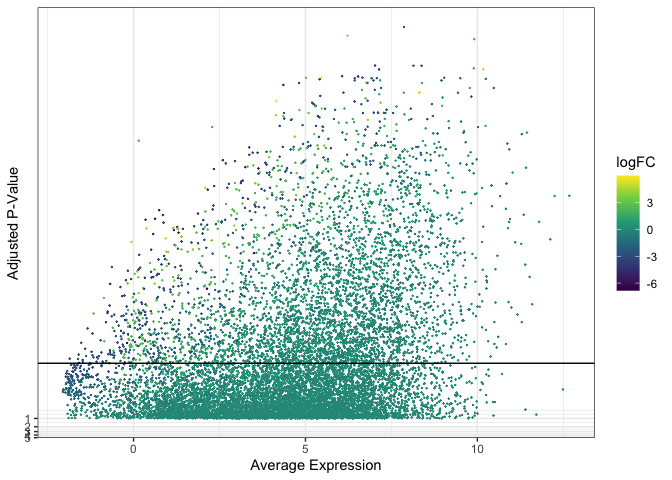
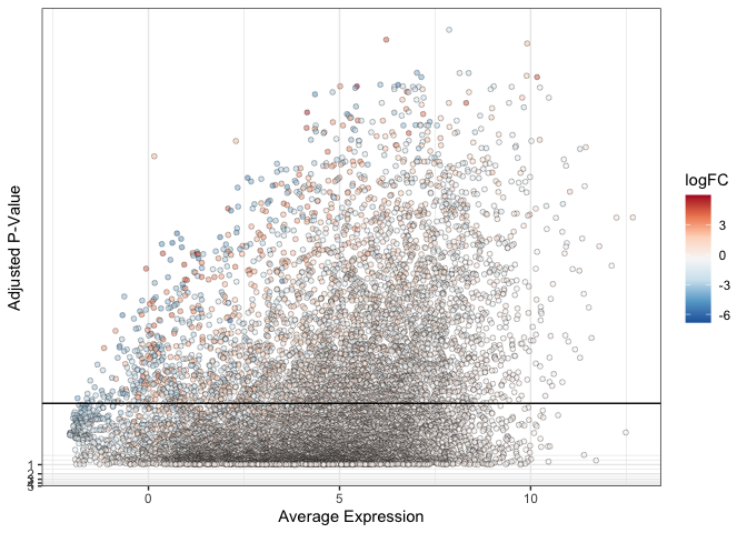
ggplot(data = de, mapping = aes(x = AveExpr, y = adj.P.Val)) +
  geom_point(mapping = aes(color = logFC)) +
  geom_hline(yintercept = 0.01) +
  scale_color_viridis_c() +
  scale_y_continuous(transform = scales::new_transform(name = "neg.log.10", transform = function(x){-log10(x)},
                                                       inverse = function(x){1 / 10**x})) +
  theme_bw() +
  labs(x = "Average Expression", y = "Adjusted P-Value")
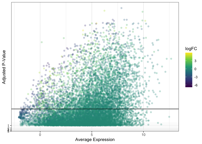
Size and alpha
When over-plotting is minimal, it may be sufficient to decrease point size and / or opacity in order to render all points visible.
ggplot(data = de, mapping = aes(x = AveExpr, y = adj.P.Val)) +
  geom_point(mapping = aes(color = logFC), size = 0.1) +
  geom_hline(yintercept = 0.01) +
  scale_color_viridis_c() +
  scale_y_continuous(transform = scales::new_transform(name = "neg.log.10", transform = function(x){-log10(x)},
                                                       inverse = function(x){1 / 10**x})) +
  theme_bw() +
  labs(x = "Average Expression", y = "Adjusted P-Value")
Reducing point size can give plots an empty appearance, while reducing opacity creates a fuzzy cloud-like look.
ggplot(data = de, mapping = aes(x = AveExpr, y = adj.P.Val)) +
  geom_point(mapping = aes(color = logFC), alpha = 0.25) +
  geom_hline(yintercept = 0.01) +
  scale_color_viridis_c() +
  scale_y_continuous(transform = scales::new_transform(name = "neg.log.10", transform = function(x){-log10(x)},
                                                       inverse = function(x){1 / 10**x})) +
  theme_bw() +
  labs(x = "Average Expression", y = "Adjusted P-Value")
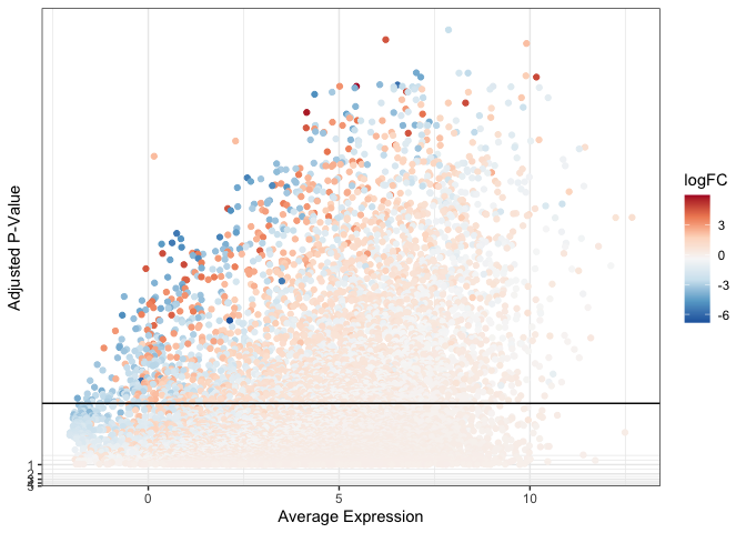
A note on color
Sometimes, convention dictates color choices for a plot. For example, red and blue on a volcano plot or a heat map, typically represent up- and down-regulation, respectively. A red / blue diverging color scheme often passes through white or near-white shades around zero, as darker shades of red and blue are employed at the ends of the spectrum. In the plot below, this creates a pale cloud of points that are difficult to distinguish against a light background, particularly if the point size or opacity is reduced.
ggplot(data = de, mapping = aes(x = AveExpr, y = adj.P.Val)) +
  geom_point(mapping = aes(color = logFC)) +
  geom_hline(yintercept = 0.01) +
  scale_color_distiller(palette = "RdBu") +
  scale_y_continuous(transform = scales::new_transform(name = "neg.log.10", transform = function(x){-log10(x)},
                                                       inverse = function(x){1 / 10**x})) +
  theme_bw() +
  labs(x = "Average Expression", y = "Adjusted P-Value")
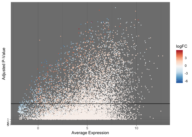
If maintaining a particular color scheme is vital, other plot elements can be adjusted to compensate for the difficulty of visualization.
The “dark” theme provides increased contrast to pastel colored points.
ggplot(data = de, mapping = aes(x = AveExpr, y = adj.P.Val)) +
  geom_point(mapping = aes(color = logFC), size = 0.25) +
  geom_hline(yintercept = 0.01) +
  scale_color_distiller(palette = "RdBu") +
  scale_y_continuous(transform = scales::new_transform(name = "neg.log.10", transform = function(x){-log10(x)},
                                                       inverse = function(x){1 / 10**x})) +
  theme_dark() +
  labs(x = "Average Expression", y = "Adjusted P-Value")
By changing the point shape to one that accepts both fill and color, we can adjust opacity without losing the near-white paint against a white background.
ggplot(data = de, mapping = aes(x = AveExpr, y = adj.P.Val)) +
  geom_point(mapping = aes(fill = logFC), alpha = 0.5, color = "black", shape = 21, stroke = 0.25) +
  geom_hline(yintercept = 0.01) +
  scale_fill_distiller(palette = "RdBu") +
  scale_y_continuous(transform = scales::new_transform(name = "neg.log.10", transform = function(x){-log10(x)},
                                                       inverse = function(x){1 / 10**x})) +
  theme_bw() +
  labs(x = "Average Expression", y = "Adjusted P-Value")
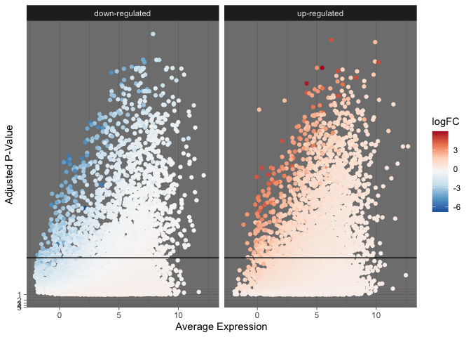
Faceting data
Additionally, the data can be segmented into multiple sub-plots to improve clarity.
de %>%
  mutate("direction" = ifelse(logFC > 0, "up-regulated", "down-regulated")) %>%
  ggplot(mapping = aes(x = AveExpr, y = adj.P.Val)) +
  geom_point(mapping = aes(color = logFC)) +
  geom_hline(yintercept = 0.01) +
  facet_wrap(~direction) +
  scale_color_distiller(palette = "RdBu") +
  scale_y_continuous(transform = scales::new_transform(name = "neg.log.10", transform = function(x){-log10(x)},
                                                       inverse = function(x){1 / 10**x})) +
  theme_dark() +
  labs(x = "Average Expression", y = "Adjusted P-Value")
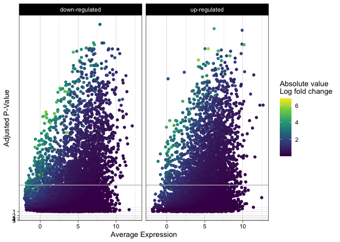
s <- de %>%
  mutate("direction" = ifelse(logFC > 0, "up-regulated", "down-regulated")) %>%
  ggplot(mapping = aes(x = AveExpr, y = adj.P.Val)) +
  geom_point(mapping = aes(color = abs(logFC))) +
  geom_hline(yintercept = 0.01, color = "gray") +
  facet_wrap(~direction) +
  scale_color_viridis_c() +
  scale_y_continuous(transform = scales::new_transform(name = "neg.log.10", transform = function(x){-log10(x)},
                                                       inverse = function(x){1 / 10**x})) +
  labs(x = "Average Expression", y = "Adjusted P-Value", color = "Absolute value\nLog fold change") +
  theme_linedraw()
s
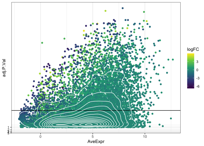
Density
If altering point size and opacity (or faceting the plot) is not enough
to reduce the over-plotting, the geom_density_2d() function can be
used to plot a contour layer over the points, showing which parts of the
plot have the highest number of observations.
ggplot(data = de, mapping = aes(x = AveExpr, y = adj.P.Val)) +
  geom_point(mapping = aes(color = logFC)) +
  geom_hline(yintercept = 0.01) +
  geom_density_2d(color = "white") +
  scale_color_viridis_c() +
  scale_y_continuous(transform = scales::new_transform(name = "neg.log.10", transform = function(x){-log10(x)},
                                                       inverse = function(x){1 / 10**x})) +
  theme_bw()
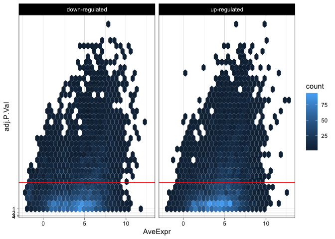
The “filled” density geom and the hex geom divide the plot area into bins and color each bin by the number of observations it contains. Now that the observation count is using the color aesthetic, we will need to facet to allow viewers to discern information related to the direction of log[2] fold expression change.
de %>%
  mutate("direction" = ifelse(logFC > 0, "up-regulated", "down-regulated")) %>%
  ggplot(mapping = aes(x = AveExpr, y = adj.P.Val)) +
  geom_hex() +
  geom_hline(yintercept = 0.01, color = "red") +
  facet_wrap(~direction) +
  scale_y_continuous(transform = scales::new_transform(name = "neg.log.10", transform = function(x){-log10(x)},
                                                       inverse = function(x){1 / 10**x})) +
  theme_linedraw()
Adjustments and annotations
Imagine that you want to produce a Manhattan plot. There’s a very straightforward library to produce these popular GWAS visualizations:
library(qqman)
manhattan(gwasResults)
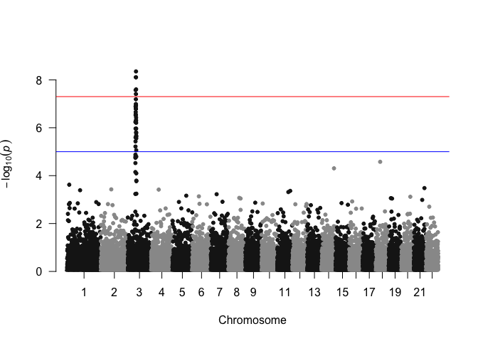
As an exercise in flexing our graphical skills, and to gain finer control over plot elements, we can recreate the Manhattan plot from this simulated data using ggplot2. After all, a Manhattan plot is essentially a very basic scatter plot that uses the same y-axis as our volcano plot example above, but genomic coordinates on the x-axis.
Let’s take a look at the GWAS data, which is a simulated output included with the qqman package for demonstration purposes.
gwasResults %>%
  slice(1:50) %>%
  kable() %>%
  kable_styling("striped", fixed_thead = TRUE) %>%
  scroll_box(height = "200px")
| SNP | CHR | BP | P |
|---|---|---|---|
| rs1 | 1 | 1 | 0.9148060 |
| rs2 | 1 | 2 | 0.9370754 |
| rs3 | 1 | 3 | 0.2861395 |
| rs4 | 1 | 4 | 0.8304476 |
| rs5 | 1 | 5 | 0.6417455 |
| rs6 | 1 | 6 | 0.5190959 |
| rs7 | 1 | 7 | 0.7365883 |
| rs8 | 1 | 8 | 0.1346666 |
| rs9 | 1 | 9 | 0.6569923 |
| rs10 | 1 | 10 | 0.7050648 |
| rs11 | 1 | 11 | 0.4577418 |
| rs12 | 1 | 12 | 0.7191123 |
| rs13 | 1 | 13 | 0.9346722 |
| rs14 | 1 | 14 | 0.2554288 |
| rs15 | 1 | 15 | 0.4622928 |
| rs16 | 1 | 16 | 0.9400145 |
| rs17 | 1 | 17 | 0.9782264 |
| rs18 | 1 | 18 | 0.1174874 |
| rs19 | 1 | 19 | 0.4749971 |
| rs20 | 1 | 20 | 0.5603327 |
| rs21 | 1 | 21 | 0.9040314 |
| rs22 | 1 | 22 | 0.1387102 |
| rs23 | 1 | 23 | 0.9888917 |
| rs24 | 1 | 24 | 0.9466682 |
| rs25 | 1 | 25 | 0.0824376 |
| rs26 | 1 | 26 | 0.5142118 |
| rs27 | 1 | 27 | 0.3902035 |
| rs28 | 1 | 28 | 0.9057381 |
| rs29 | 1 | 29 | 0.4469696 |
| rs30 | 1 | 30 | 0.8360043 |
| rs31 | 1 | 31 | 0.7375956 |
| rs32 | 1 | 32 | 0.8110551 |
| rs33 | 1 | 33 | 0.3881083 |
| rs34 | 1 | 34 | 0.6851697 |
| rs35 | 1 | 35 | 0.0039483 |
| rs36 | 1 | 36 | 0.8329161 |
| rs37 | 1 | 37 | 0.0073341 |
| rs38 | 1 | 38 | 0.2076590 |
| rs39 | 1 | 39 | 0.9066014 |
| rs40 | 1 | 40 | 0.6117786 |
| rs41 | 1 | 41 | 0.3795592 |
| rs42 | 1 | 42 | 0.4357716 |
| rs43 | 1 | 43 | 0.0374310 |
| rs44 | 1 | 44 | 0.9735399 |
| rs45 | 1 | 45 | 0.4317512 |
| rs46 | 1 | 46 | 0.9575766 |
| rs47 | 1 | 47 | 0.8877549 |
| rs48 | 1 | 48 | 0.6399788 |
| rs49 | 1 | 49 | 0.9709666 |
| rs50 | 1 | 50 | 0.6188382 |
We can start building up the plot the same way we did for the volcano plot.
ggplot(data = gwasResults, mapping = aes(x = BP, y = P)) +
  scale_y_continuous(transform = scales::new_transform(name = "neg.log.10", transform = function(x){-log10(x)}, inverse = function(x){1 / 10**x})) +
  geom_hline(yintercept = c(5e-8, 1e-5), color = c("red", "blue")) +
  geom_point(mapping = aes(color = as.factor(CHR))) +
  scale_color_manual(values = rep(c("gray60", "gray20"), length(levels(as.factor(gwasResults$CHR)))/2)) +
  guides(color = "none") +
  labs(y = bquote(-log[10](P))) +
  theme_bw() +
  theme(axis.title.x = element_blank(),
        axis.ticks.y = element_blank(),
        axis.text.y = element_blank(),
        panel.grid.minor = element_blank(),
        panel.grid.major.y = element_blank())
Immediately, an issue becomes apparent; points for all of the chromosomes are plotted on the same coordinate system. We can attempt to resolve this with faceting.
ggplot(data = gwasResults, mapping = aes(x = BP, y = P)) +
  scale_y_continuous(transform = scales::new_transform(name = "neg.log.10", transform = function(x){-log10(x)}, inverse = function(x){1 / 10**x})) +
  geom_point(mapping = aes(color = as.factor(CHR))) +
  scale_color_manual(values = rep(c("gray60", "gray20"), length(levels(as.factor(gwasResults$CHR)))/2)) +
  facet_grid(~ as.factor(CHR), switch = "x") +
  guides(color = "none") +
  labs(y = bquote(-log[10](P))) +
  theme_minimal() +
  theme(axis.title.x = element_blank(),
        axis.ticks = element_blank(),
        axis.text = element_blank(),
        panel.grid.minor = element_blank(),
        panel.grid.major = element_blank(),
        panel.spacing = unit(0, "lines"))
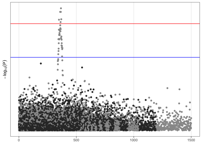
This is a bit more readable, but we have lost the horizontal rules that displayed significance thresholds, and there is unused white space between chromosomes on the x axis. Adjusting the data itself may be the easier approach.
gwasResults.adjust <- gwasResults %>%
  group_by(CHR) %>%
  summarise("coord.min" = min(BP), "coord.max" = max(BP)) %>%
  ungroup() %>%
  mutate(offset = cumsum(coord.max) - coord.max - coord.min + 1)

gwasResults.adjust <- left_join(gwasResults, gwasResults.adjust, by = "CHR") %>%
  mutate(display.coord = BP + offset)

gwasResults.anno <- filter(gwasResults.adjust, P < 5e-8)
The code above removes any “empty” space between chromosomes by subtracting the minimum coordinate for each chromosome from the running total of all previous chromosomes maximum coordinates.
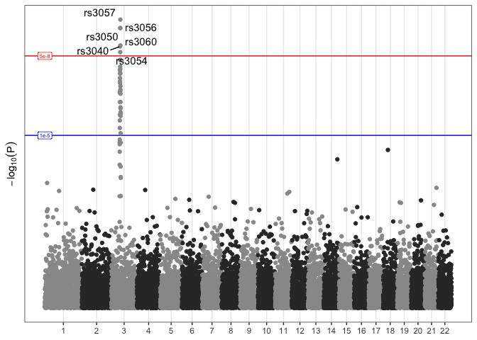
t <- ggplot(data = gwasResults.adjust, mapping = aes(x = display.coord, y = P)) +
  geom_hline(yintercept = c(5e-8, 1e-5), color = c("red", "blue")) +
  geom_point(mapping = aes(color = as.factor(CHR))) +
  scale_color_manual(values = rep(c("gray60", "gray20"), 11)) +
  guides(color = "none") +
  geom_text_repel(data = gwasResults.anno, mapping = aes(label = SNP)) +
  scale_y_continuous(transform = scales::new_transform(name = "neg.log.10", transform = function(x){-log10(x)}, inverse = function(x){1 / 10**x})) +
  annotate(geom = "label", x = c(0,0), y = c(5e-8, 1e-5), label = c("5e-8", "1e-5"), color = c("red", "blue"), size = 2) +
  labs(y = bquote(-log[10](P))) +
  scale_x_continuous(breaks = tapply(gwasResults.adjust$display.coord, as.factor(gwasResults.adjust$CHR), median)) +
  theme_bw() +
  theme(axis.title.x = element_blank(),
        axis.ticks.y = element_blank(),
        axis.text.y = element_blank(),
        panel.grid.minor = element_blank(),
        panel.grid.major.y = element_blank())
t
Now that our custom Manhattan plot is a ggplot object, we can add as
much information as we like, modify axes and labels, plot background and
gridlines, and so on. For most purposes, though, the default plot
produced by qqman’s manhattan() function is perfectly fine. However,
it’s always nice to know that you can recreate and customize a
visualization as needed!
Prepare for the next section
In this section, we learned many techniques to customize a ggplot2 plot, with a focus on the scatterplot. You can now make MDS, UMAP, volcano, dot, and Manhattan plots, among many others!
Before closing out this section, download the .Rmd for the next section: box plots, violin plots, and combining plots into multi-panel figures.
sessionInfo()
## R version 4.5.1 (2025-06-13)
## Platform: aarch64-apple-darwin20
## Running under: macOS Monterey 12.4
##
## Matrix products: default
## BLAS:   /Library/Frameworks/R.framework/Versions/4.5-arm64/Resources/lib/libRblas.0.dylib
## LAPACK: /Library/Frameworks/R.framework/Versions/4.5-arm64/Resources/lib/libRlapack.dylib;  LAPACK version 3.12.1
##
## locale:
## [1] en_US.UTF-8/en_US.UTF-8/en_US.UTF-8/C/en_US.UTF-8/en_US.UTF-8
##
## time zone: America/Los_Angeles
## tzcode source: internal
##
## attached base packages:
## [1] stats     graphics  grDevices utils     datasets  methods   base
##
## other attached packages:
## [1] qqman_0.1.9      ggrepel_0.9.6    ggplot2_3.5.2    kableExtra_1.4.0
## [5] magrittr_2.0.3   dplyr_1.1.4
##
## loaded via a namespace (and not attached):
##  [1] gtable_0.3.6       compiler_4.5.1     tidyselect_1.2.1   Rcpp_1.1.0
##  [5] xml2_1.3.8         stringr_1.5.1      systemfonts_1.2.3  scales_1.4.0
##  [9] textshaping_1.0.1  yaml_2.3.10        fastmap_1.2.0      lattice_0.22-7
## [13] hexbin_1.28.5      R6_2.6.1           labeling_0.4.3     generics_0.1.4
## [17] isoband_0.2.7      knitr_1.50         MASS_7.3-65        tibble_3.3.0
## [21] svglite_2.2.1      pillar_1.11.0      RColorBrewer_1.1-3 rlang_1.1.6
## [25] calibrate_1.7.7    stringi_1.8.7      xfun_0.52          viridisLite_0.4.2
## [29] cli_3.6.5          withr_3.0.2        digest_0.6.37      grid_4.5.1
## [33] rstudioapi_0.17.1  lifecycle_1.0.4    vctrs_0.6.5        evaluate_1.0.4
## [37] glue_1.8.0         farver_2.1.2       rmarkdown_2.29     tools_4.5.1
## [41] pkgconfig_2.0.3    htmltools_0.5.8.1