
Introduction to bar, column, alluvial, and chord plots
Bar and column charts are among the simplest visualizations available; a rectangular area represents the relationship between a categorical value and a quantitative one. The related alluvial diagram adds an additional layer of complexity by overlaying connections between the bars. A chord diagram is very similar to an alluvial diagram, but circularized.
Bar chart
A bar chart is useful for displaying count data. The independent variable is categorical, and the dependent variable (the bar’s height) corresponds to the number of observations within each category.
Column chart
A column chart is simply a more flexible bar chart. Column height may represent data points, rather than counts.
Alluvial diagram
Alluvial diagrams allow the display of one data point’s value across several categorical variables, with each column representing a single variable. All columns have the same height, and each is partitioned (using fill) to display the frequency of values for the corresponding variable. Ribbons connecting each column to the next reveal relationships between categorical variables.
Chord diagram
A chord diagram is effectively an alluvial diagram on polar coordinates. It shares the characteristic flow indicator ribbons, but instead of a horizontal axis, the “columns” are wrapped around a circle.
Set up
Packages
In addition to ggplot2, we will be using ggalluvial, which builds on ggplot2 functions to create alluvial diagrams, and circlize, a package design to bring circos-style plots into R. The tidyverse packages dplyr and tidyr are used to reshape data for ggplot2.
library(ggplot2)
library(dplyr)
library(tidyr)
library(ggalluvial)
library(circlize)
Data
We will be using a few different data sources in this section.
# cluster membership data for bar chart
sc.data <- read.csv("sc_data.csv")
cluster.data <- select(sc.data, cell, subcluster, subcluster_ScType_filtered)
cluster.data$subcluster_ScType_filtered <- gsub("Unknown", NA, cluster.data$subcluster_ScType_filtered)
cluster.data$group <- factor(gsub("B001-A-301", "Normal", gsub("A001-C-104", "Polyp", gsub("A001-C-007", "Cancer", sapply(strsplit(cluster.data$cell, split = "_"), "[[", 2)))), levels = c("Normal", "Polyp", "Cancer"))
# KEGG data for column chart
kegg <- read.csv("mouse_KEGG.csv")
# expression value data for column chart
expression.pivot <- pivot_longer(sc.data, names_to = "gene", values_to = "normalized.counts", cols = SATB2:LEFTY1) %>%
  select(cell, gene, normalized.counts)
# treatment data for alluvial diagram
treatment.df <- read.csv("treatment.csv")
# VDJ data for chord diagrams
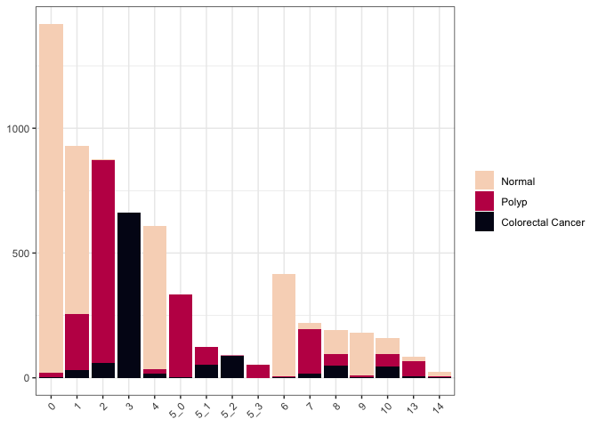
Counting occurances with bar charts
Count-based data is the simplest and most straightforward application of this type of chart.
ggplot(data = cluster.data, mapping = aes(x = subcluster, fill = group)) +
  geom_bar() +
  scale_fill_viridis_d(option = "rocket", end = 0.95, direction = -1) +
  theme_bw() +
  theme(legend.title = element_blank(),
        axis.title = element_blank(),
        axis.text.x = element_text(angle = 45, hjust = 1))
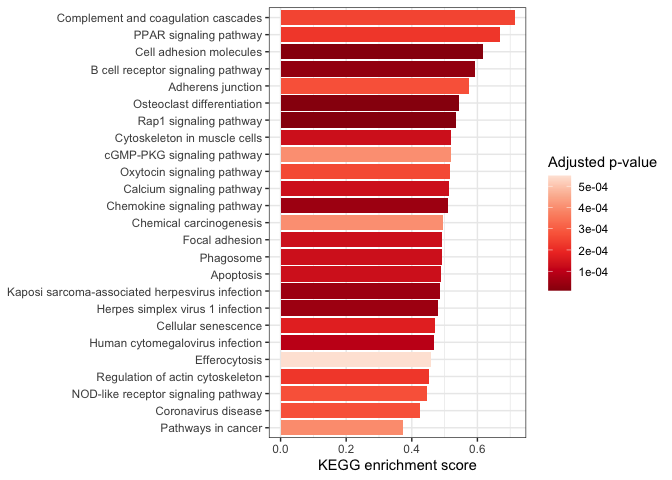
Displaying numerical values with column charts
A single value
Representing a single value with a column chart is simple, but there are relatively few occasions in bioinformatics where this is the most useful visualization style. When dealing with high-throughput data, it’s rare to have a single observation of any variable.
One good application is as an alternative to dot plots in gene set enrichment analyses.
kegg$short.description <- sapply(strsplit(kegg$Description, split = " - ", fixed = TRUE), "[[", 1L)

arrange(kegg, pvalue) %>%
  slice_head(n = 25) %>%
  ggplot(mapping = aes(x = short.description, y = enrichmentScore, fill = p.adjust)) +
  geom_col() +
  scale_fill_distiller(palette = "Reds") +
  labs(y = "KEGG enrichment score", fill = "Adjusted p-value") +
  coord_flip() +
  theme_bw() +
  theme(axis.title.y = element_blank())
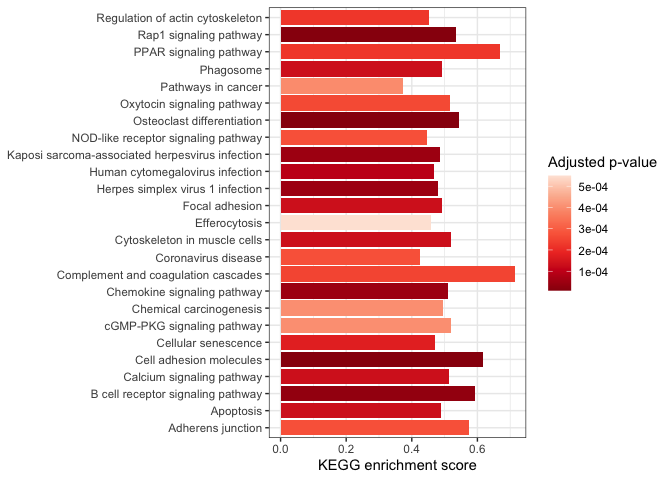 By default,
ggplot2 arranges characters alphanumerically; our categorical axis is
arranged with “Adherens junction” at one end and “Regulation of actin
cytoskeleton” at the other. We can change the “short.description”
character vector to a factor to control the ordering (e.g. with the most
enriched pathway at the top).
By default,
ggplot2 arranges characters alphanumerically; our categorical axis is
arranged with “Adherens junction” at one end and “Regulation of actin
cytoskeleton” at the other. We can change the “short.description”
character vector to a factor to control the ordering (e.g. with the most
enriched pathway at the top).
kegg.small <- arrange(kegg, pvalue) %>%
  slice_head(n = 25)
kegg.small$short.description <- factor(kegg.small$short.description, levels = kegg.small$short.description[order(kegg.small$enrichmentScore, decreasing = FALSE)])

ggplot(data = kegg.small,
       mapping = aes(x = short.description,
                     y = enrichmentScore,
                     fill = p.adjust)) +
  geom_col() +
  scale_fill_distiller(palette = "Reds") +
  labs(y = "KEGG enrichment score", fill = "Adjusted p-value") +
  coord_flip() +
  theme_bw() +
  theme(axis.title.y = element_blank())
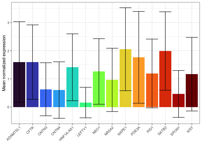
A computed value
Think carefully about the appropriateness of using column charts to display a computed mean. In many cases a box or violin plot may be more informative; these visualizations are designed to for comparing distributions.
If the standard for your field is a column chart, or you have few enough observations that a column chart is more readable than a box or violin plot, make sure to add an indication of the variability of your data (e.g. an error bar).
summarise(expression.pivot,
          .by = gene,
          mean = mean(normalized.counts),
          sd = sd(normalized.counts)) %>%
  ggplot(mapping = aes(x = gene, fill = gene)) +
  geom_col(mapping = aes(y = mean)) +
  geom_errorbar(mapping = aes(ymin = mean - sd, ymax = mean + sd)) +
  scale_fill_viridis_d(option = "turbo") +
  guides(fill = "none") +
  labs(y = "Mean normalized expression") +
  theme_bw() +
  theme(axis.title.x = element_blank(),
        axis.text.x = element_text(angle = 45, hjust = 1))
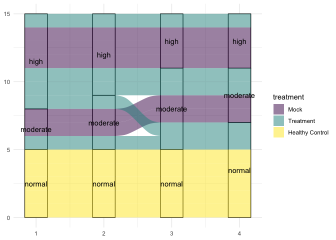
Connecting categorical values with alluvial diagrams
Alluvial diagrams are particularly useful for showing the transition of data from one state to another over time.
treatment.df
##     X id treatment day_0 day_14 day_28 day_42
## 1   1  A         A  53.8   45.4   32.9   27.4
## 2   2  B         A  65.6   65.1   53.4   51.0
## 3   3  C         A  62.2   57.4   44.5   43.2
## 4   4  D         A  43.7   38.0   31.7   17.4
## 5   5  E         A  67.0   53.0   45.5   37.0
## 6   6  F         B  55.4   55.0   52.5   50.7
## 7   7  G         B  67.4   66.7   63.9   62.9
## 8   8  H         B  91.7   90.3   85.3   83.2
## 9   9  I         B  99.5   97.2   96.3   94.4
## 10 10  J         B  50.7   46.2   44.9   42.5
## 11 11  K   Control  45.5   47.4   49.6   49.8
## 12 12  L   Control  86.7   88.3   90.0   90.8
## 13 13  M   Control  97.0   97.8  100.4  102.5
## 14 14  N   Control  32.3   33.1   33.2   35.2
## 15 15  O   Control  93.0   95.2   96.8   98.4
## 16 16  P   Healthy  13.4   13.5   13.6   14.1
## 17 17  Q   Healthy  18.9   19.3   19.4   19.9
## 18 18  R   Healthy  20.9   21.3   21.7   21.9
## 19 19  S   Healthy  10.1   10.4   10.4   10.8
## 20 20  T   Healthy   0.9    1.1    1.3    1.5
treatment.df <- treatment.df[treatment.df$treatment != "B",]
treatment.categorical <- apply(treatment.df[,c("day_0", "day_14", "day_28", "day_42")], 2, function(x){
  ifelse(x > 50, "high", ifelse(x > 30, "moderate", "normal"))
})
treatment.categorical <- cbind(treatment.df[,c("id", "treatment")], treatment.categorical)
treatment.categorical$treatment <- gsub("Control", "Mock", treatment.categorical$treatment)
treatment.categorical$treatment <- gsub("Healthy", "Healthy Control", treatment.categorical$treatment)
treatment.categorical$treatment <- gsub("A", "Treatment", treatment.categorical$treatment)
treatment.categorical$treatment <- factor(treatment.categorical$treatment,
                                          levels = c("Mock", "Treatment", "Healthy Control"))

ggplot(data = treatment.categorical, mapping = aes(axis1 = day_0,
                                                   axis2 = day_14,
                                                   axis3 = day_28,
                                                   axis4 = day_42)) +
  geom_stratum() +
  geom_alluvium(aes(fill = treatment)) +
  geom_text(stat = "stratum", aes(label = paste(after_stat(stratum)))) +
  scale_fill_viridis_d() +
  theme_minimal()
Circularization
Further uses for circos-style visualizations
Prepare for the next section
download.file("https://raw.githubusercontent.com/ucdavis-bioinformatics-training/2025-August-Intermediate-Visualization-for-Bioinformatics/refs/heads/master/R/04-custom.Rmd", "04-custom.Rmd")
sessionInfo()
## R version 4.5.1 (2025-06-13)
## Platform: aarch64-apple-darwin20
## Running under: macOS Monterey 12.4
##
## Matrix products: default
## BLAS:   /Library/Frameworks/R.framework/Versions/4.5-arm64/Resources/lib/libRblas.0.dylib
## LAPACK: /Library/Frameworks/R.framework/Versions/4.5-arm64/Resources/lib/libRlapack.dylib;  LAPACK version 3.12.1
##
## locale:
## [1] en_US.UTF-8/en_US.UTF-8/en_US.UTF-8/C/en_US.UTF-8/en_US.UTF-8
##
## time zone: America/Los_Angeles
## tzcode source: internal
##
## attached base packages:
## [1] stats     graphics  grDevices utils     datasets  methods   base
##
## other attached packages:
## [1] circlize_0.4.16   ggalluvial_0.12.5 tidyr_1.3.1       dplyr_1.1.4
## [5] ggplot2_3.5.2
##
## loaded via a namespace (and not attached):
##  [1] vctrs_0.6.5         cli_3.6.5           knitr_1.50
##  [4] rlang_1.1.6         xfun_0.52           purrr_1.1.0
##  [7] generics_0.1.4      labeling_0.4.3      glue_1.8.0
## [10] colorspace_2.1-1    htmltools_0.5.8.1   GlobalOptions_0.1.2
## [13] scales_1.4.0        rmarkdown_2.29      grid_4.5.1
## [16] evaluate_1.0.4      tibble_3.3.0        fastmap_1.2.0
## [19] yaml_2.3.10         lifecycle_1.0.4     compiler_4.5.1
## [22] RColorBrewer_1.1-3  pkgconfig_2.0.3     rstudioapi_0.17.1
## [25] farver_2.1.2        digest_0.6.37       viridisLite_0.4.2
## [28] R6_2.6.1            tidyselect_1.2.1    shape_1.4.6.1
## [31] pillar_1.11.0       magrittr_2.0.3      withr_3.0.2
## [34] tools_4.5.1         gtable_0.3.6