
Advanced and custom plots
In this section we will cover a number of unrelated types of plots that require extensions to ggplot2 or different libraries. While many unique visualizations exist, we have limited time to cover them in class and have selected a few popular styles:
- Expression heat map
- Dendrogram
- TSS enrichment
- Genomic coverage
Set up
Packages
In addition to ggplot2, we will use the ggplot extension libraries ggtree and ggcoverage as well as ComplexHeatmap, which uses a completely different “grammar.” Seurat and Signac functions create wrappers around ggplot2, and produce plot objects that can be further modified using ggplot grammar.
library(ComplexHeatmap)
library(viridis)
library(ggplot2)
library(Signac)
library(Seurat)
library(ggtree)
library(ggcoverage)
Data
We will be making use of a few different data sets in this section: one for each of the plots.
# scRNA for heat map
sc.data <- read.csv("sc_data.csv")
# dendrogram data
download.file("https://raw.githubusercontent.com/GuangchuangYu/ggtree-current-protocols/refs/heads/master/mskcc.txt", "mskcc.txt")
tree.data <- read.delim("mskcc.txt", row.names = 1)
# ATAC-seq for TSS enrichment
# genomic coverage data
track.df <- LoadTrackFile(track.folder = system.file("extdata", "RNA-seq", package = "ggcoverage"),
              format = "bw",
              region = "chr14:21,677,306-21,737,601",
              extend = 2000,
              meta.info = read.csv(system.file("extdata", "RNA-seq", "meta_info.csv", package = "ggcoverage")))
gtf <- rtracklayer::import.gff(con = system.file("extdata", "used_hg19.gtf", package = "ggcoverage"), format = "gtf")
Heat map
Heat maps use areas of color to display expression intensity for samples across a number of markers. While it is possible to create heat maps that display expression values for all genes, reading these plots becomes difficult when the number of markers is much greater than 25-30. For single cell or single nucleus experiments, the number of samples may be in the tens or hundreds of thousands. In this case, the purpose of the plot is to get a general overview, not assess expression in any given sample, and the area corresponding to each cell or nucleus is very small.
Basic heat map
sc.mat <- as.matrix(sc.data[,5:18])
rownames(sc.mat) <- sc.data$cell
sc.mat <- t(sc.mat)
Heatmap(matrix = sc.mat,
        name = "normalized\ncounts")
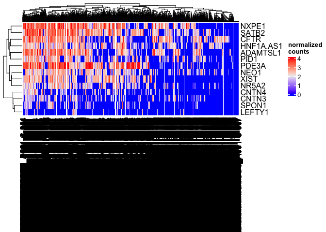
The column dendrogram and names are illegible; with more than six thousand cells, the overlap between lines is extensive. The length of the column names has also caused vertical compression of the heat map as the plot area is reduced to accommodate the axis text.
Heatmap(matrix = sc.mat,
        name = "normalized\ncounts",
        show_column_dend = FALSE,
        show_column_names = FALSE)
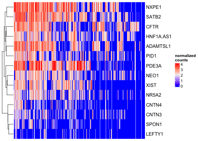
There are many excellent features in ComplexHeatmap that allow you to tune the readability of your visualization and emphasize the findings of the greatest importance.
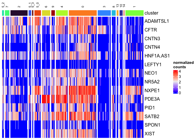
Annotated heat map
Having removed the cell names and dendrogram in pursuit of readability, we now lack any information about the sample identity of the cells in our heatmap. This can be added back in with a column annotation.
sc.data$subcluster_ScType_filtered <- gsub("Unknown", NA, sc.data$subcluster_ScType_filtered)
celltype.colors <- viridis(length(names(table(sc.data$subcluster_ScType_filtered))))
names(celltype.colors) <- names(table(sc.data$subcluster_ScType_filtered))
cluster.colors <- viridis(length(unique(sc.data$subcluster)), option = "turbo")
names(cluster.colors) <- unique(sc.data$subcluster)
top.anno <- columnAnnotation("cluster" = sc.data$subcluster,
                             "celltype" = sc.data$subcluster_ScType_filtered,
                             col = list("cluster" = cluster.colors,
                                        "celltype" = celltype.colors),
                             na_col = "gray90")
Heatmap(matrix = sc.mat,
        name = "normalized\ncounts",
        show_column_dend = FALSE,
        show_column_names = FALSE,
        top_annotation = top.anno)
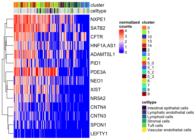
Since we have so many missing values in our cell type data, we may not want to include that annotation.
Split heat map
These heat maps can be divided into slices to group rows, columns, or both. Heat maps can be split following variation in the data (using k-means clustering), or by categorical values in the metadata.
Split on k-means clustering
The code below demonstrates k-means clustering on the rows (markers) of the heat map. K is provided by the user.
Heatmap(matrix = sc.mat,
        name = "normalized\ncounts",
        show_column_dend = FALSE,
        show_column_names = FALSE,
        top_annotation = top.anno,
        row_km = 3)
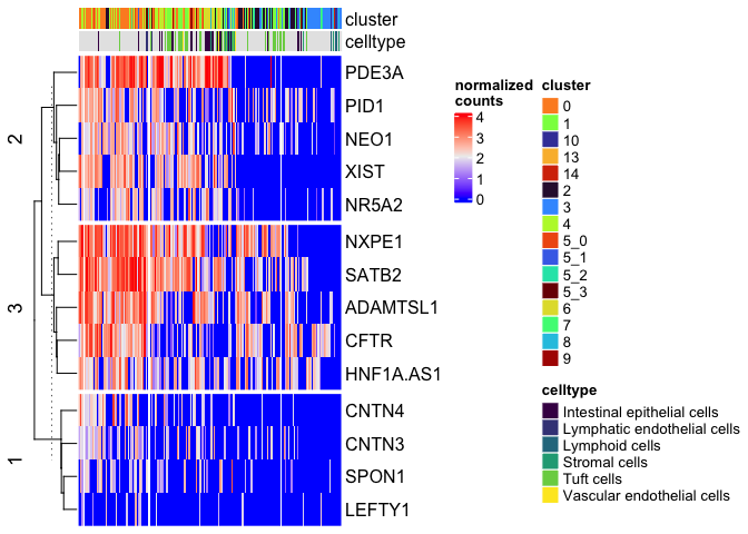
Split on metadata
We can add a column split on the sub-cluster as well.
Heatmap(matrix = sc.mat,
        name = "normalized\ncounts",
        show_column_dend = FALSE,
        show_column_names = FALSE,
        top_annotation = top.anno,
        row_km = 3,
        column_split = sc.data$subcluster)
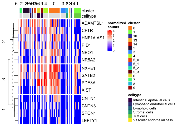
Overriding default row and column ordering
The row and column order of the matrix can be set manually, as well.
Heatmap(matrix = sc.mat,
        name = "normalized\ncounts",
        show_column_dend = FALSE,
        show_column_names = FALSE,
        top_annotation = top.anno,
        row_order = sort(colnames(sc.data)[5:18]),
        column_split = sc.data$subcluster)
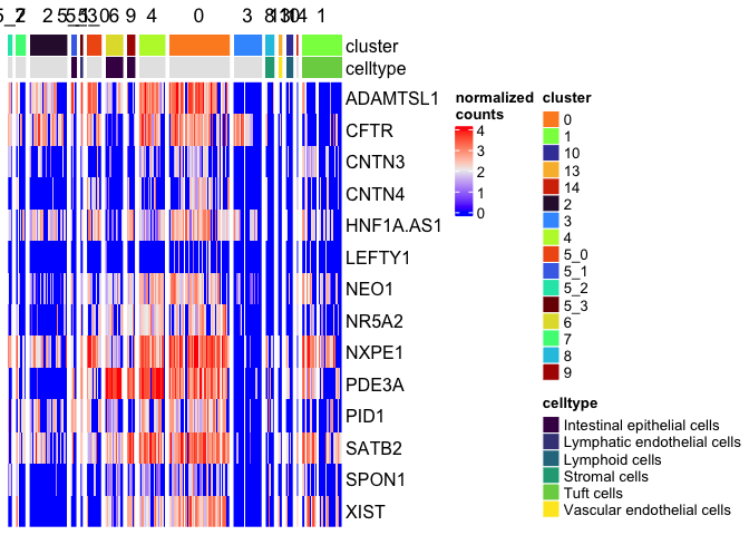
Let’s arrange the legends and labels to improve readability. We don’t need a legend for the cluster identities, since the splits are labeled. To simplify, I am also going to remove the “celltype” annotation, which has many missing values.
Heatmap(matrix = sc.mat,
        name = "normalized\ncounts",
        show_column_dend = FALSE,
        show_column_names = FALSE,
        top_annotation = HeatmapAnnotation("cluster" = sc.data$subcluster,
                                           col = list("cluster" = cluster.colors),
                                           na_col = "gray90",
                                           show_legend = c("cluster" = FALSE)),
        row_order = sort(colnames(sc.data)[5:18]),
        column_split = sc.data$subcluster,
        column_title_gp = gpar(fontsize = 8),
        column_title_rot = 90)
… And so much more
ComplexHeatmap, is, as the name suggests a complex package with many, many options to explore. If you don’t see the modification you’re looking for here, take a look at the documentation.
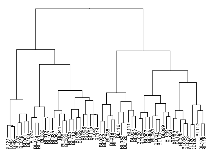
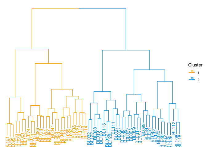
Dendrogram
Dendrograms diagram similarity. They may appear on the axes of heatmaps and other visualizations (as we saw above), or on their own.
tree.distance <- as.dist(1 - cor(tree.data, method = "pearson"))
tree.clusters <- hclust(tree.distance, method = "ward.D")
p <- ggtree(tree.clusters) +
  layout_dendrogram() +
  geom_tiplab(hjust = 1) +
  theme_dendrogram()
p
clusters <- cutree(tree.clusters, k = 2)
groupOTU(p, split(names(clusters), clusters), group_name = "Cluster") +
  aes(color = Cluster) +
  scale_color_manual(breaks = c(1, 2), values = c("goldenrod2", "deepskyblue3"))
TSS enrichment
A TSS enrichment plot is a very simple line-based visualization showing the increase in coverage around the transcription start site in an ATAC-Seq or other chromatin accessibility assay.
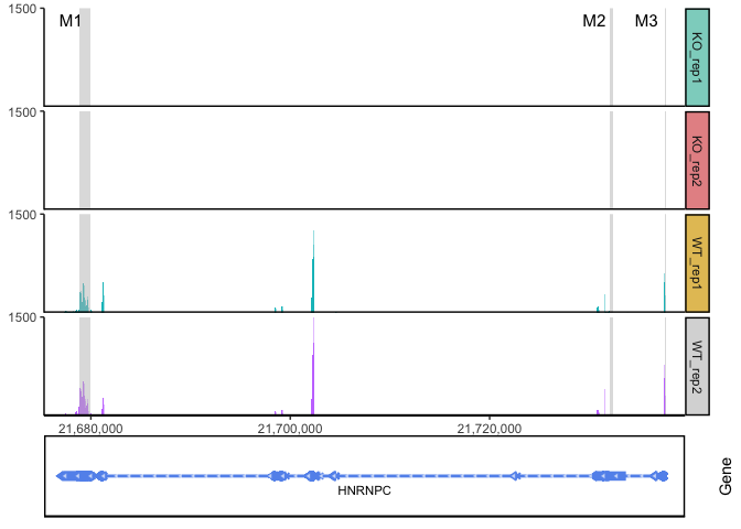
Genomic coverage
Coverage plots allow visualization of counts-based data (RNA transcripts, ChIP, etc) on a genomic coordinate system. Unlike the TSS enrichment plot above, results are typically not aggregated across a group of features of the same type, but instead displayed on unique genomic ranges. These plots are frequently annotated with a cartoon displaying features of interest and / or an ideogram showing the chromosomal structure.
ggcoverage(data = track.df, plot.type = "joint", facet.key = "Type", group.key = "Type")
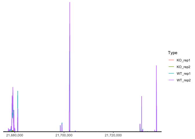
region <- data.frame(start = c(21678900, 21732001, 21737590),
                     end = c(21679900, 21732400, 21737650),
                     label = c("M1", "M2", "M3"))
ggcoverage(data = track.df, plot.type = "joint", facet.key = "Type", group.key = "Type", mark.region = region, range.position = "out")
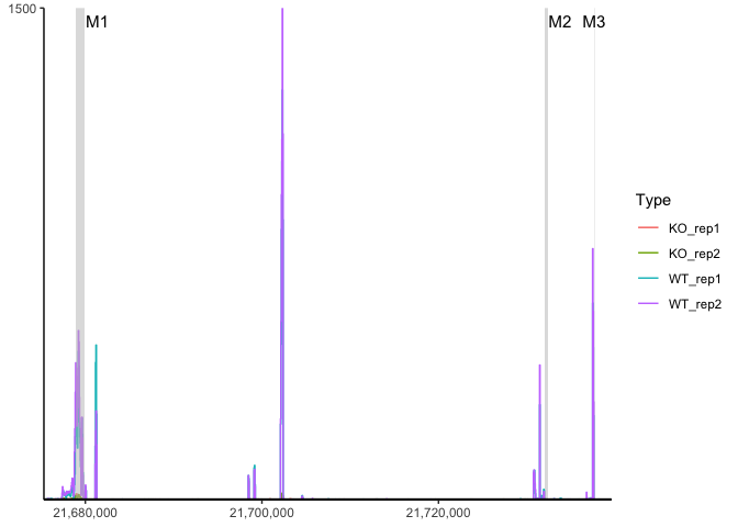
ggcoverage(data = track.df, plot.type = "joint", facet.key = "Type", group.key = "Type", mark.region = region, range.position = "out") +
  geom_gene(gtf.gr = gtf)
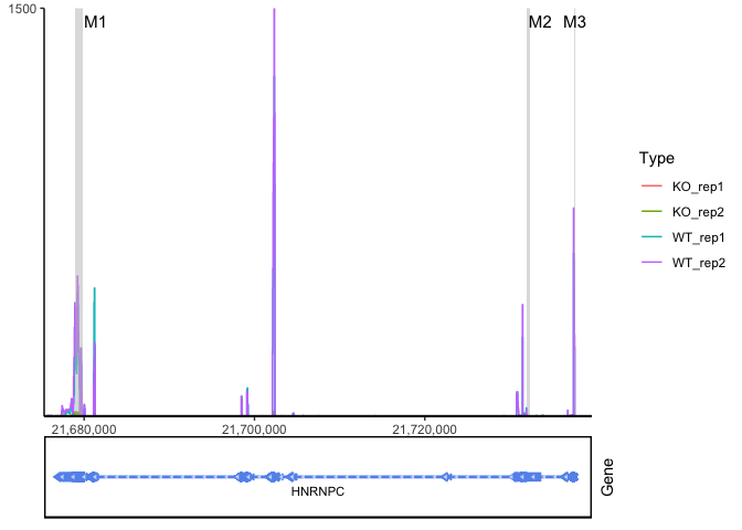
ggcoverage(data = track.df, plot.type = "facet", facet.key = "Type", group.key = "Type", mark.region = region, range.position = "out") +
  geom_gene(gtf.gr = gtf)
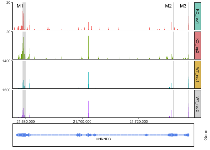
ggcoverage(data = track.df, plot.type = "facet", facet.key = "Type", group.key = "Type", mark.region = region, range.position = "out", facet.y.scale = "fixed") +
  geom_gene(gtf.gr = gtf)
Final thoughts
There are many types of visualizations we haven’t had the chance to cover, and more visualizations are developed all the time. We hope that what you’ve learned within this course will allow you to customize your plots and figures to communicate your findings.
Here are a few things to think about as you choose how to present your work using graphics:
-
Color Make sure to choose colors that provide sufficient contrast between relevant data. Try to keep color palettes small; using a limited number of colors (typically no more than 12 within one figure) increases the readability of figures.
-
Size Accurately estimating differences in area is difficult, so consider alternatives to pie charts and other area-based visualizations. Additionally, differences in size (e.g. of points) imply quantitative differences within the data; point size should not be mapped to a qualitative measure. Make sure that any plot elements are sized so that they are easily distinguishable. Ideally, they will be large enough to see clearly, but small enough to avoid extensive overlaps.
-
Redundancy Each graphical attribute of a plot communicates information. When choosing which to use in any given figure, consider whether redundancy (e.g. using both point color and point shape to denote treatment group) increases clarity or introduces unnecessary complexity. Sometimes, using fewer aesthetics speeds reader comprehension.
-
Consistency Maintain the order of categorical values on axes across figures. Any time a color palette is re-used within a publication, poster, or presentation, it should map to the same values to avoid confusion.
We hope this workshop has been helpful for you! Please email us at bioinformatics-training@ucdavis.edu with any questions or comments about the course or course materials, and alert us to any issues on GitHub.
sessionInfo()
## R version 4.5.1 (2025-06-13)
## Platform: aarch64-apple-darwin20
## Running under: macOS Monterey 12.4
##
## Matrix products: default
## BLAS:   /Library/Frameworks/R.framework/Versions/4.5-arm64/Resources/lib/libRblas.0.dylib
## LAPACK: /Library/Frameworks/R.framework/Versions/4.5-arm64/Resources/lib/libRlapack.dylib;  LAPACK version 3.12.1
##
## locale:
## [1] en_US.UTF-8/en_US.UTF-8/en_US.UTF-8/C/en_US.UTF-8/en_US.UTF-8
##
## time zone: America/Los_Angeles
## tzcode source: internal
##
## attached base packages:
## [1] grid      stats     graphics  grDevices utils     datasets  methods
## [8] base
##
## other attached packages:
##  [1] ggcoverage_1.4.1      ggtree_3.16.3         Seurat_5.3.0
##  [4] SeuratObject_5.1.0    sp_2.2-0              Signac_1.14.0
##  [7] ggplot2_3.5.2         viridis_0.6.5         viridisLite_0.4.2
## [10] ComplexHeatmap_2.24.1
##
## loaded via a namespace (and not attached):
##   [1] RcppAnnoy_0.0.22            splines_4.5.1
##   [3] later_1.4.2                 BiocIO_1.18.0
##   [5] bitops_1.0-9                ggplotify_0.1.2
##   [7] tibble_3.3.0                polyclip_1.10-7
##   [9] XML_3.99-0.18               fastDummies_1.7.5
##  [11] lifecycle_1.0.4             doParallel_1.0.17
##  [13] globals_0.18.0              lattice_0.22-7
##  [15] MASS_7.3-65                 magrittr_2.0.3
##  [17] plotly_4.11.0               rmarkdown_2.29
##  [19] yaml_2.3.10                 httpuv_1.6.16
##  [21] sctransform_0.4.2           spam_2.11-1
##  [23] spatstat.sparse_3.1-0       reticulate_1.43.0
##  [25] cowplot_1.2.0               pbapply_1.7-4
##  [27] RColorBrewer_1.1-3          abind_1.4-8
##  [29] Rtsne_0.17                  GenomicRanges_1.60.0
##  [31] purrr_1.1.0                 RCurl_1.98-1.17
##  [33] BiocGenerics_0.54.0         yulab.utils_0.2.0
##  [35] circlize_0.4.16             GenomeInfoDbData_1.2.14
##  [37] ggpattern_1.1.4             IRanges_2.42.0
##  [39] S4Vectors_0.46.0            ggrepel_0.9.6
##  [41] irlba_2.3.5.1               listenv_0.9.1
##  [43] spatstat.utils_3.1-5        tidytree_0.4.6
##  [45] goftest_1.2-3               RSpectra_0.16-2
##  [47] spatstat.random_3.4-1       fitdistrplus_1.2-4
##  [49] parallelly_1.45.1           DelayedArray_0.34.1
##  [51] codetools_0.2-20            RcppRoll_0.3.1
##  [53] tidyselect_1.2.1            shape_1.4.6.1
##  [55] aplot_0.2.8                 UCSC.utils_1.4.0
##  [57] farver_2.1.2                matrixStats_1.5.0
##  [59] stats4_4.5.1                spatstat.explore_3.5-2
##  [61] GenomicAlignments_1.44.0    jsonlite_2.0.0
##  [63] GetoptLong_1.0.5            progressr_0.15.1
##  [65] ggridges_0.5.6              survival_3.8-3
##  [67] iterators_1.0.14            foreach_1.5.2
##  [69] tools_4.5.1                 treeio_1.32.0
##  [71] ica_1.0-3                   Rcpp_1.1.0
##  [73] glue_1.8.0                  SparseArray_1.8.1
##  [75] gridExtra_2.3               xfun_0.52
##  [77] MatrixGenerics_1.20.0       GenomeInfoDb_1.44.1
##  [79] dplyr_1.1.4                 withr_3.0.2
##  [81] fastmap_1.2.0               ggh4x_0.3.1
##  [83] digest_0.6.37               R6_2.6.1
##  [85] mime_0.13                   gridGraphics_0.5-1
##  [87] colorspace_2.1-1            scattermore_1.2
##  [89] tensor_1.5.1                spatstat.data_3.1-6
##  [91] tidyr_1.3.1                 generics_0.1.4
##  [93] data.table_1.17.8           rtracklayer_1.68.0
##  [95] httr_1.4.7                  htmlwidgets_1.6.4
##  [97] S4Arrays_1.8.1              uwot_0.2.3
##  [99] pkgconfig_2.0.3             gtable_0.3.6
## [101] lmtest_0.9-40               XVector_0.48.0
## [103] htmltools_0.5.8.1           dotCall64_1.2
## [105] clue_0.3-66                 scales_1.4.0
## [107] Biobase_2.68.0              png_0.1-8
## [109] spatstat.univar_3.1-4       ggfun_0.2.0
## [111] knitr_1.50                  rstudioapi_0.17.1
## [113] reshape2_1.4.4              rjson_0.2.23
## [115] curl_6.4.0                  nlme_3.1-168
## [117] zoo_1.8-14                  GlobalOptions_0.1.2
## [119] stringr_1.5.1               KernSmooth_2.23-26
## [121] parallel_4.5.1              miniUI_0.1.2
## [123] restfulr_0.0.16             pillar_1.11.0
## [125] vctrs_0.6.5                 RANN_2.6.2
## [127] promises_1.3.3              xtable_1.8-4
## [129] cluster_2.1.8.1             evaluate_1.0.4
## [131] cli_3.6.5                   compiler_4.5.1
## [133] Rsamtools_2.24.0            rlang_1.1.6
## [135] crayon_1.5.3                future.apply_1.20.0
## [137] labeling_0.4.3              plyr_1.8.9
## [139] fs_1.6.6                    stringi_1.8.7
## [141] deldir_2.0-4                BiocParallel_1.42.1
## [143] Biostrings_2.76.0           lazyeval_0.2.2
## [145] spatstat.geom_3.5-0         Matrix_1.7-3
## [147] RcppHNSW_0.6.0              patchwork_1.3.1
## [149] future_1.67.0               shiny_1.11.1
## [151] SummarizedExperiment_1.38.1 ROCR_1.0-11
## [153] igraph_2.1.4                fastmatch_1.1-6
## [155] ape_5.8-1